Designing with AI: how I changed the UX and UX-Eng workflow
Putting AI to work between design and code at Cyara, across product audits, mockups, design-to-engineering handoff and UX's place in an AI-driven development lifecycle.
- Client
- Cyara
- Role
- UX Manager: hands-on designer and team lead
- Industry
- UX management and UX engineering
- Team
- Senior UI/UX Designer, UI/UX Developer
- Year
- 2026
- Tools
- Claude Enterprise, Claude Code, Figma + MCP, Storybook, Playwright, axe-core, Pendo
Over the past year I’ve changed how UX work gets done at Cyara: how products are audited, how mockups are drafted, how design hands off to engineering, and where UX fits in an AI-driven development lifecycle. I do the hands-on work myself and set the direction for the team around it. The rule behind both: AI translates and finds patterns, people interpret, prioritise and sign off.
- 31 issues found in one AI-assisted product audit
- 6 products compared and unified in one Figma file
- 6 → 1 navigation patterns, proposed convergence
- 3 months for a compressed AI adoption plan across four phases
The problem: six products, one team, and a lot of manual translation
Cyara’s portfolio spans six products: Core, Number Trust, Voice Assure, testRTC, ResolveAX and Botium. Each had its own look, its own navigation and its own status language. UX was expected to audit, redesign, document and hand off across all of them while engineering moved to an AI-driven lifecycle, and I worked on that both as a hands-on designer and as the lead of a three-person team.
Manual audits, hand-built mockups and spec documents were the bottleneck. I used AI at each of those points, with a human checkpoint at each one. I did much of the hands-on work myself, then set the plan and guardrails so the team can use the same methods.
Case 1: AI-assisted UX audit of Agentic Test Case Designer
From a screen-by-screen review to a prioritised, formula-driven tracker.
- Hands-on: I ran the audit, reviewed every AI-drafted finding and built the tracker.
- Leadership: I set the scope and the prioritisation method, and carried the systemic findings into the suite-level plan.
Problem statement and brief
The Agentic Test Case Designer (TCD) had grown screen by screen, and the team had no single view of its usability, consistency and accessibility issues, or of which to fix first.
Brief: produce an audit the team can act on, with every finding tied to a screenshot, a suggested fix and a priority.
Context
Agentic TCD is part of Cyara’s automated CX testing platform. The audit covered Campaigns, New Campaign, Test Cases and Agentic Tests, New/Edit Agentic Test, Reporting, and the Designer canvas. The reference point was Cyara Rocket, the internal design system, with its ultramarine, San Marino and malibu blue palette.
Preliminary research and discussion
User feedback came first: the historical run view in the Designer canvas leaves too little room to read conversation steps, and the hide-summary and hide-audio toggles only partly solve it. I then walked each page group with annotated screenshots and checked them against Rocket components and colours.
The key discussion was scope. Rather than one giant pass, I chose a progressive audit, one page group at a time, so findings could be reviewed and reprioritised as they came in.
Approach
- Feed annotated screenshots to Claude and have it draft findings, suggested fixes, and Impact and Effort ratings.
- Review every drafted line against product context. Nothing went into the tracker unreviewed.
- Edit my existing tracker in place instead of building a new workbook: 10 columns, tabs for Overall, New Agentic TC, TCD, Campaign Index and Report, and a Priority score calculated by formula from Impact and Effort.
- Write a short brief document alongside the tracker for stakeholders who won’t open a spreadsheet.
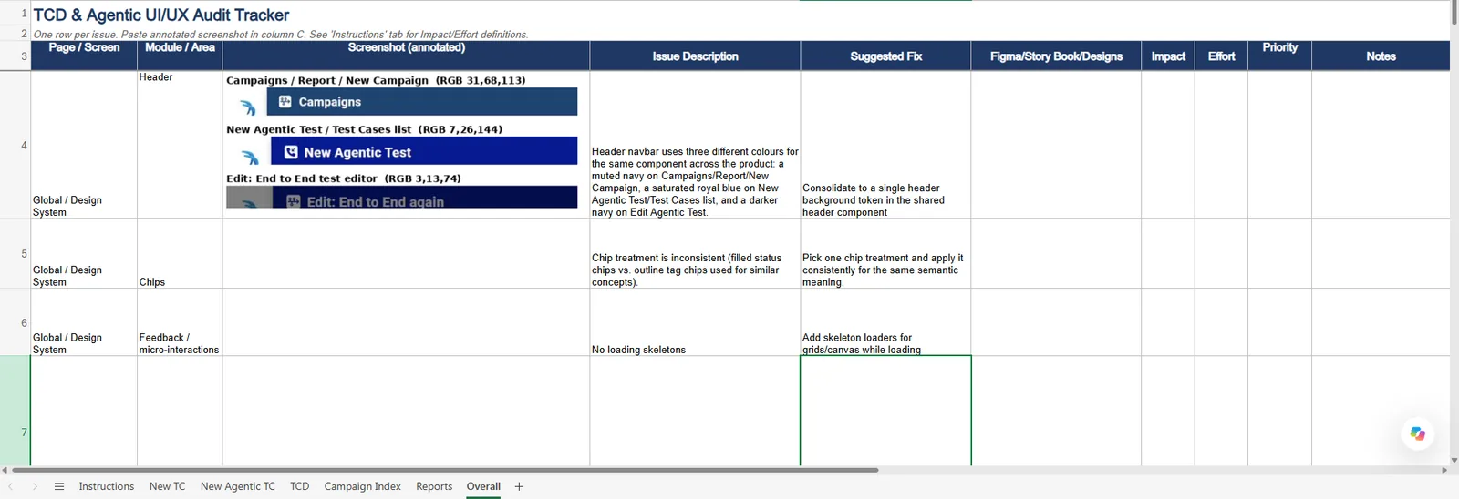
Result: 31 issues, split by scope
28 page-level issues and 3 cross-page systemic issues. Notable findings:
- Missing flow connector lines in the Designer canvas.
- A clipped “Sensitive Data” badge on a compliance-critical field.
- A “Classic View” migration toggle shipping in the production UI.
- Three distinct navy header shades where one was intended.
Status: delivered
Tracker and audit brief are complete. The three systemic findings fed directly into Case 2.
Reflection
AI was fastest at turning screenshots into consistent, well-structured findings. It was weakest at business context: whether a clipped badge was a cosmetic bug or a compliance risk was a human call. Editing my own tracker in place meant the output fit my existing workflow and was usable immediately.
Case 2: From one audit to a six-product unification plan
Unified Look 2026, built in the Cyara UX Team Figma workspace.
- Hands-on: I ran the cross-product comparison and drove the high-fidelity Figma build with Claude.
- Leadership: I set the direction and made the typeface, icon, density and accessibility decisions.
Problem statement and brief
Cyara’s six products don’t look or behave like one company. The audit found different colours, navigation and status language from product to product.
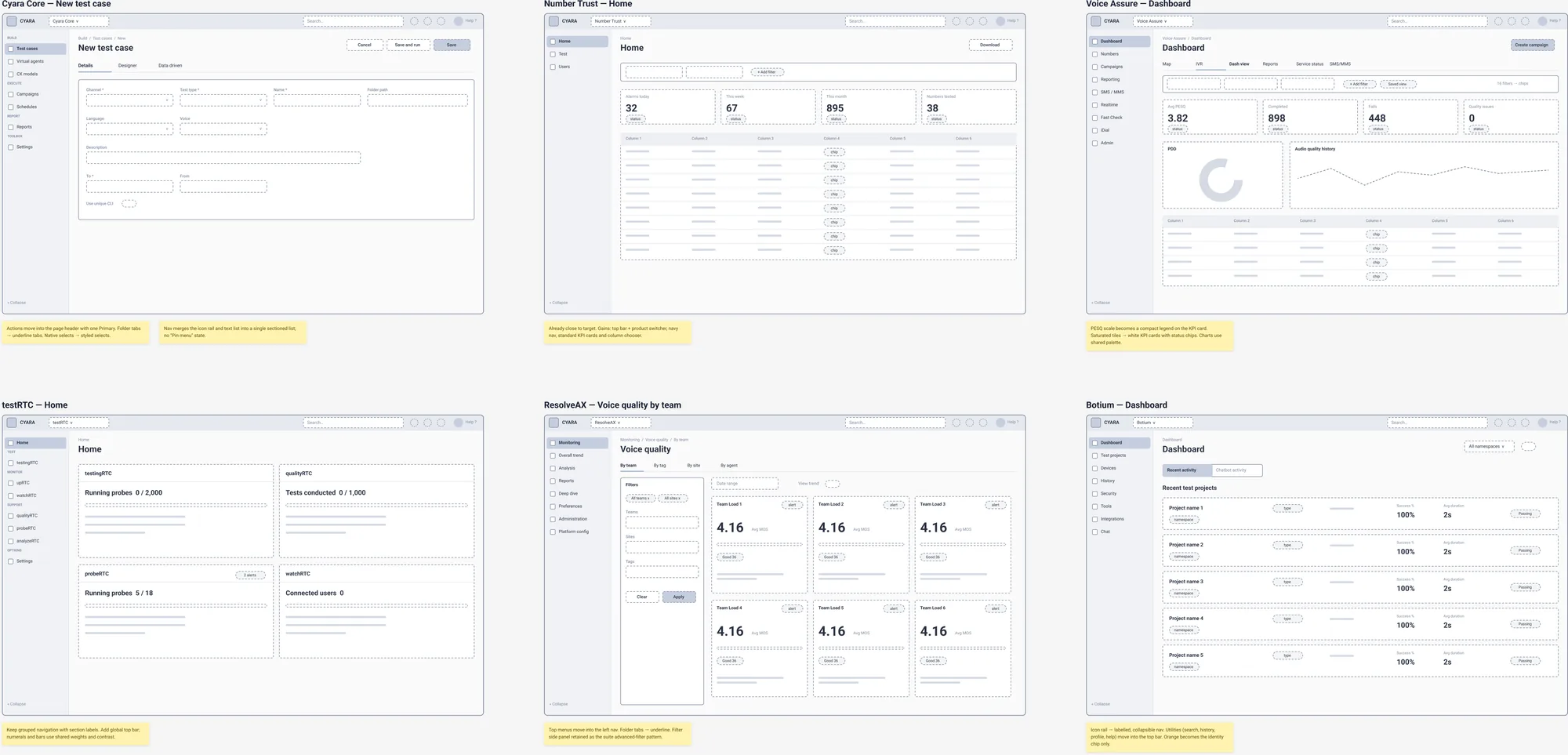
Brief: audit the UI/UX of every product, propose one unified direction, and show it in rough sketches and then high-fidelity mockups.
Context
Six products: Cyara Core, Number Trust, Voice Assure, testRTC, ResolveAX and Botium. A three-person UX team, and one design system (Rocket) that needed to serve all six.
Preliminary research and discussion
The TCD audit exposed three cross-page systemic issues, so I extended the same method across the suite and used AI to compare screens side by side and count the inconsistencies.
| Inconsistency found | Now | Unified target |
|---|---|---|
| Primary colour palettes | 6 | 1 shared token set |
| Navigation patterns | 6 | 1 shell |
| Help treatments | 3 | 1 pattern |
| Tab and view-switch styles | 3 | 1 pattern |
| Navy header shades (TCD) | 3 | 1 |
Variants found in the audit. Targets come from the unification proposal.
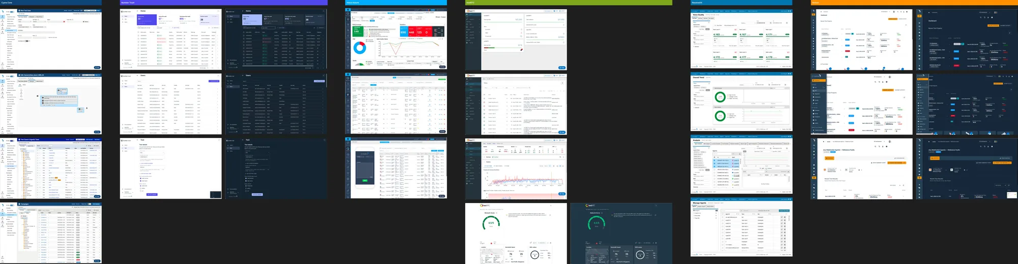
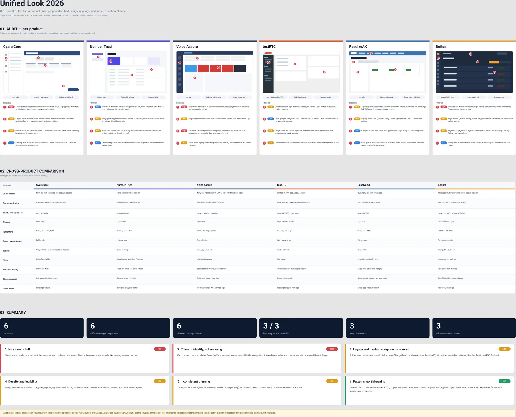
The discussion that shaped the proposal was how much to unify. I modelled it on Google’s suite: one shared token layer, with each product free to flex on density.
Approach
A three-phase roadmap: shared design tokens first, then navigation shell convergence, then a full re-skin. Fidelity escalated in steps from text findings to annotated screenshots, HTML mockups, Figma wireframes and high-fidelity Figma.
| Decision | Choice |
|---|---|
| Typeface | Roboto, switched from Inter across all pages |
| Icons | Font Awesome |
| Density | Compact, with a narrow navigation rail |
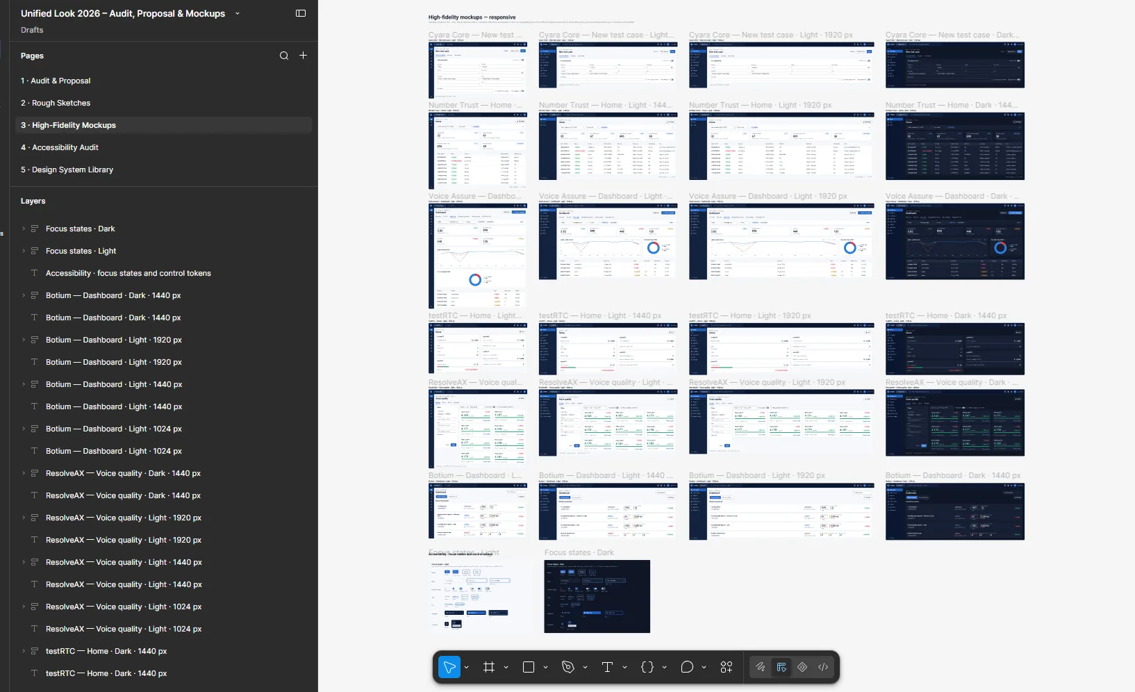
| Responsive range | Content from 1024px to 1920px wide |
| Accessibility target | WCAG 2.1 A and AA, checked on the mockups with findings on a separate page |
Result
High-fidelity mockups of all six products with custom navigation icons, drop shadows and real chart geometry, including donut arcs, ring gauges and multi-series line charts for Voice Assure. The Figma file has five pages: Audit and Proposal, Rough Sketches, High-Fidelity Mockups, Accessibility Audit (focus states and control tokens) and a Design System Library covering all products.
Status: proposed
Mockups and roadmap are complete. The three-phase rollout is a proposal.
Reflection
Counting inconsistencies turned a vague “the products don’t match” into numbers a leader could act on. The work escalated well because each stage was cheap enough to throw away. The risk was losing direction along the way, so I kept explicit decisions (typeface, icons, density, breakpoints) written down as I made them.
Case 3: Generating mockups through the Figma MCP
Exploring layouts quickly, then documenting what it took to get reliable output.
- Hands-on: I wrote the direction, ran the generation sessions and worked out the plugin patterns.
- Leadership: I set the fidelity progression and wrote the patterns down for reuse.
Problem statement and brief
Dense screens like the Designer canvas need several layout directions compared before one is chosen, and hand-building each in Figma is slow.
Brief: use AI to produce comparable options at a fidelity stakeholders can react to, directly in Figma.
Context
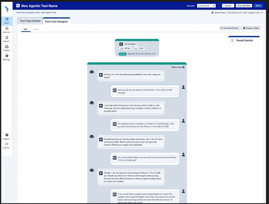
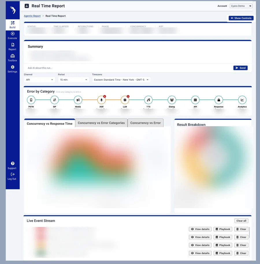
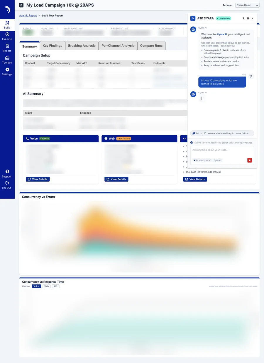
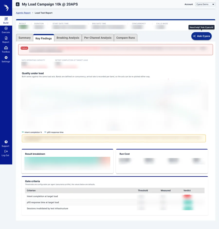
The same screens from Case 1, plus Agentic product reports: a real-time Agentic Cruncher dashboard and an Agentic Load Test Report. Output had to match Rocket colours, so it could move toward engineering without a redraw.
Preliminary research and discussion
I gathered references before generating anything: the trace-plus-transcript pattern from Okareo, Balsamiq-style wireframes for early conversations, and HTTP request builder patterns from tools like Postman and n8n. The discussion was which directions deserved to be built at all.
Approach
- Give specific direction: exact colours, named inspiration, and the layouts I wanted tried.
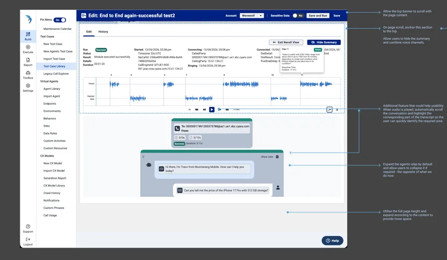
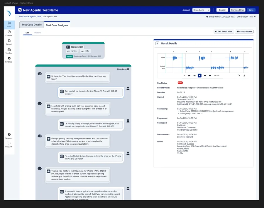
- Generate several directions in one session: stacked accordion, right rail (my proposal), palette-matched, and Okareo-inspired trace plus transcript with per-turn pass/fail.
- Narrow, then raise fidelity.
- Document each plugin-API quirk as it appeared, so the next session started from a working pattern.
// Append all children first, resize last.
// Resizing an auto-layout frame early collapses it to 1px high.
// Transparent wrapper: clear the default white fill.
function tal(dir, props) {
  const f = figma.createAutoLayout(dir, props);
  f.fills = [];
  return f;
}
Result
A set of comparable canvas layouts, interactive wireframes and dashboards for the Agentic reports, the high-fidelity file from Case 2, and a short library of tested patterns for auto-layout, transparent frames, polygons and donut arcs.
Status: in use
Used for the Unified Look and Agentic mockups. The pattern library keeps growing as new quirks turn up.
Reflection
Output quality tracked the specificity of my direction. “Make it better” produced generic screens, while exact colours, a named reference and a chosen layout produced usable ones. Writing the quirks down turned one-off fixes into reusable knowledge.
Case 4: Defining UX’s role in the AI development lifecycle, and a plan to adopt AI
Strengthening existing design touchpoints, then proving the value with guardrails and scoped pilots.
- Hands-on: I wrote the proposal, the team onboarding guide and FAQ, and designed the research pilot and the audit method.
- Leadership: I defined UX’s role, wrote the adoption plan, set the guardrails, shaped the message for each audience, am aligning product and engineering, and built the executive deck for the C-suite.
Problem statement and brief
Engineering was moving to an AI-driven lifecycle. It was unclear where UX fit, how generated designs would stay on-system, and how UX’s own AI use would grow beyond individual experiments. Leadership, engineering and product each needed a different answer to “how is UX using AI, and how do we know it works?”
Brief: define UX’s role in the lifecycle as modifications to existing steps, and formalise AI adoption across the UX workflow as a structured plan tied to our actual toolchain, without creating a parallel process.
Context
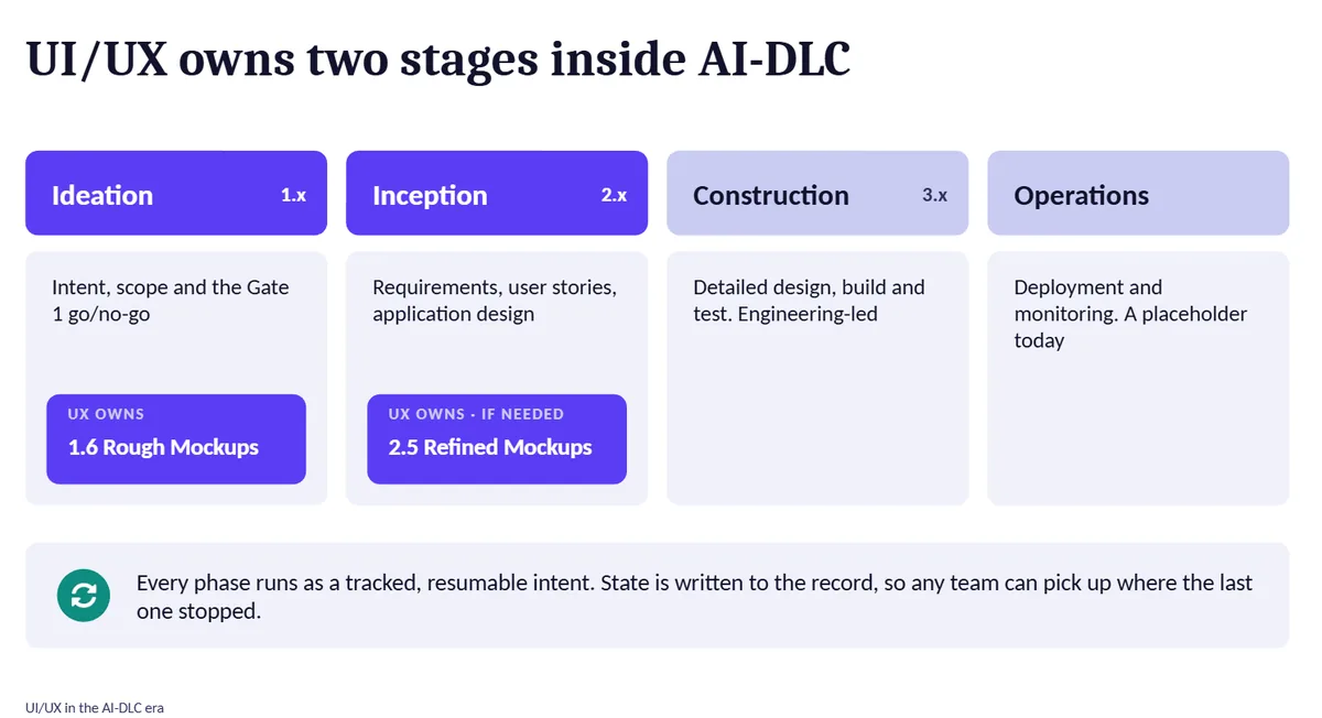
Cyara’s proprietary AI development lifecycle (version 2) already had two design touchpoints, rough mockups at ideation and refined mockups at inception, with a product-lead agent reviewing design output.
On the UX side: a team of three, me, a Senior UI/UX Designer with design sign-off authority, and a UI/UX Developer. The design system lives in Figma and publishes to Storybook as React tokens. Figma Code Connect mapping was about halfway complete under the UX Developer.
Preliminary research and discussion
The internal workshop deck and the “get started” guide set the ground truth. One correction mattered: mockups sit at ideation and inception, not in Construction as I had first assumed. I rebuilt the proposal around the real stages.
The framing decision was to pitch this to engineering as “strengthen the seats that exist”, because a new gate would have been rejected.
Two findings shaped the adoption plan. First, research synthesis is the highest-leverage, lowest-risk place to start, while usability moderation and persistent research repositories are still beyond current AI tools. Second, Cyara’s app sits behind SSO, so off-the-shelf AI audit tools gave only partial coverage.
Approach
In the lifecycle, my proposal makes two changes to existing steps, and they work together:
- Design input required. An existing Figma frame or design-system component becomes the required input before the design agent drafts a mockup.
- Compliance review. The product-lead agent’s refined-mockup review extends to design-system and token compliance.
Practical flow: Product asks UX to start the lifecycle and resume the mockup stage, UX generates mockups with the Figma MCP, and Product attends. I wrote the proposal, a team onboarding guide with an FAQ, and an executive deck for the Chief Product Officer and C-suite.
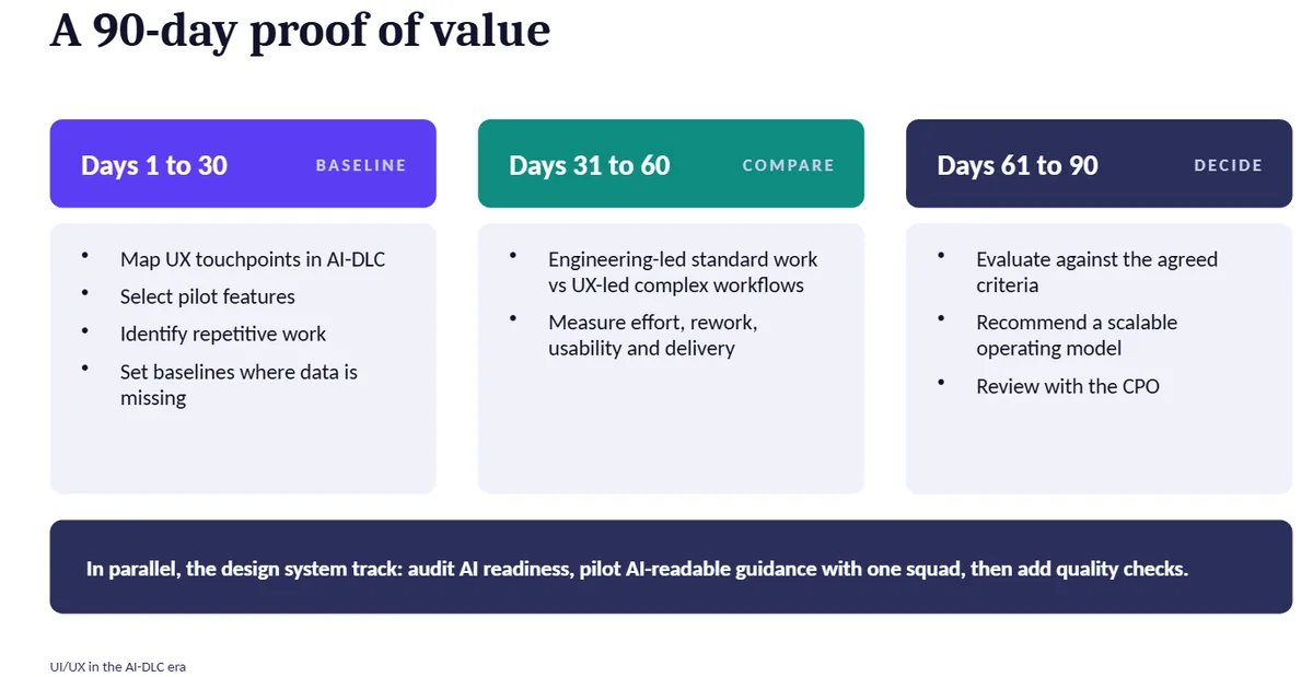
The adoption plan has four phases, compressed into three months and followed by a quarterly cycle:
- Foundation: tooling, design-system inputs, ground rules.
- Pilot: scoped trials with real metrics.
- Embed: fold what worked into daily workflow.
- Optimise: quarterly review and tuning.
Each audience got its own view: a roadmap and milestones for leadership, pipeline diagrams for engineering, and a phase-to-framework mapping for product.
- Research pilot: Claude Enterprise turns raw interview and product briefing notes into structured findings with cited quotes, benchmarked against manual synthesis time.
- Audit harness: Playwright with stored session state to get behind login, axe-core for automated WCAG scanning, and Claude for heuristic analysis at scale, in six phases that mirror the lifecycle.
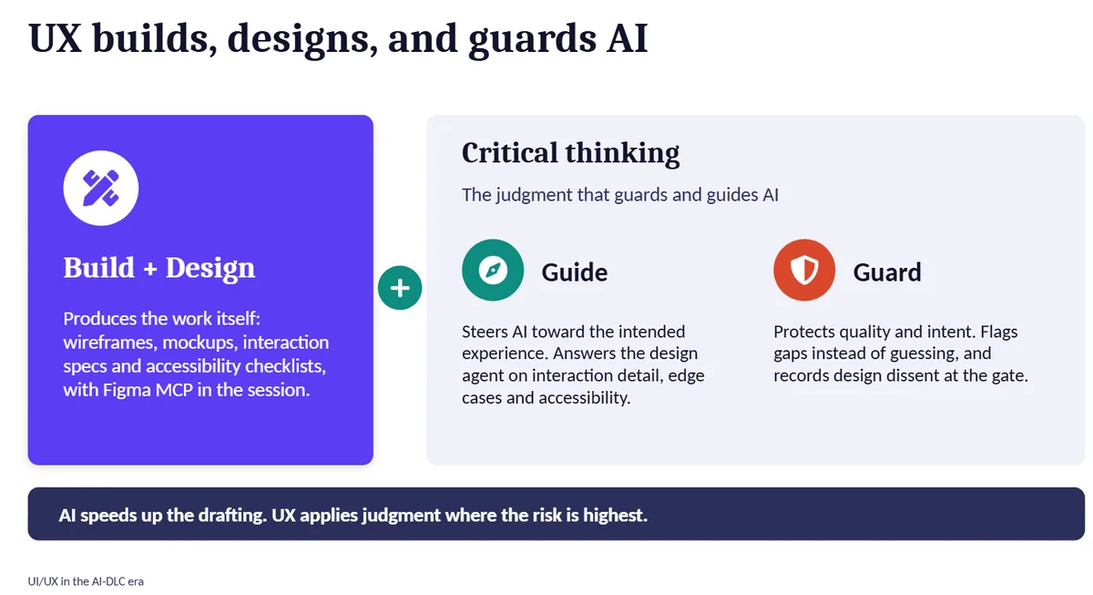
- Stays human: route and role scoping, triage of axe-core “incomplete” flags, validating AI-drafted findings against business context, and all screen reader and keyboard testing.
Result
A written proposal, a UI/UX team playbook with FAQ, an executive deck, and an adoption plan as a Word document and a PowerPoint deck, with an appendix on AI for research and a goal statement for the second half of 2026. The key output is a clear answer to “what does UX do in the lifecycle”, in language written for both engineering and product.
The executive deck frames UX as owning two stages, building and guarding AI output, and proposes a 90-day proof of value: baseline, compare, decide, with a parallel design-system track. Pendo analytics are planned from mid-September 2026 through mid-2027 to track sessions, adoption and feature rollout.
Status: in progress
Proposal, onboarding guide, executive deck and adoption plan are written. Alignment with the Engineering Director and the executive review are the next steps. The research pilot is scoped, Code Connect mapping is about halfway, and the Pendo rollout is planned.
Reflection
Buy-in came from framing, not from the content of the proposal: strengthen the seats that exist, and run scoped pilots with real numbers instead of asking for a mandate. Naming what stays human, up front, answers the biggest worry before anyone raises it. Reading the source material also caught my own wrong assumption early, a reminder to verify AI-assisted plans against the real artefacts before they reach other teams.
What I learned: principles I now work by
Scoped pilots with real metrics beat full mandates for engineering buy-in.
- Integrate, don’t parallel. Frame AI work as changes to existing touchpoints, so nobody has to adopt a second process.
- Start from the system. Require a real component or frame as input, so generated work is on-brand by construction.
- Make it measurable. Every pilot has a baseline and a number.
- Humans own the call. AI does translation and pattern-finding; interpretation, prioritisation and sign-off stay with the team.
- Edit in place. Work inside the team’s existing files and structures so output is usable on day one.